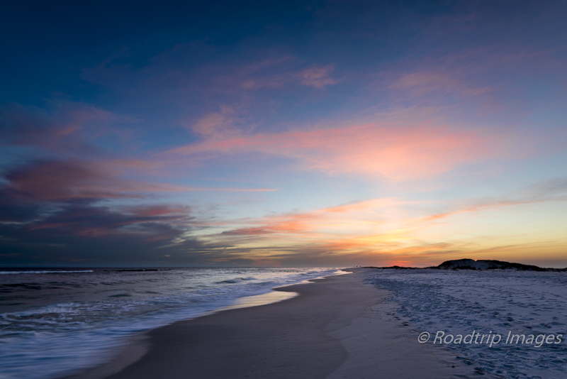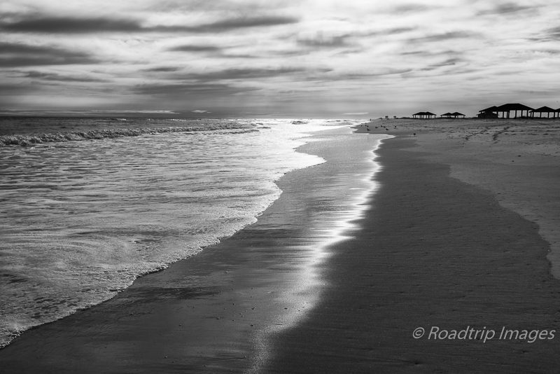
On a recent visit to Gulf Island National Seashore, a late afternoon scene caught my eye. It was a high contrast situation and the sun reflecting off the water and sand was what I wanted to capture. I didn’t anticipate it at the time but this was a perfect scene for black and white.
This particular scene had nice layers to it. The ocean waves, the surf, and the wet sand. Nice parallel lines leading into the image. I also liked the buildings silhouetted against the sky and the bright clouds off in the distance. I wanted to make an image that felt like a late, hazy afternoon at the seashore.
I took a number of images as the waves came in, trying to capture some interesting shapes. I decided against a long shutter speed that would blur the water as I wanted to get a crisp edge to the surf rolling onto the beach. There’s no real science to this part. Just stand there with a remote shutter release and click when you see a pattern that looks interesting.
When I got back to the coach and started reviewing images that evening, I wasn’t sure I had what I was looking for. Although I worked the image in Lightroom and Photoshop, the colors in the image just didn’t do it for me. It wasn’t bad, it just wasn’t that good either. That’s when it hit me. This is a black and white image.
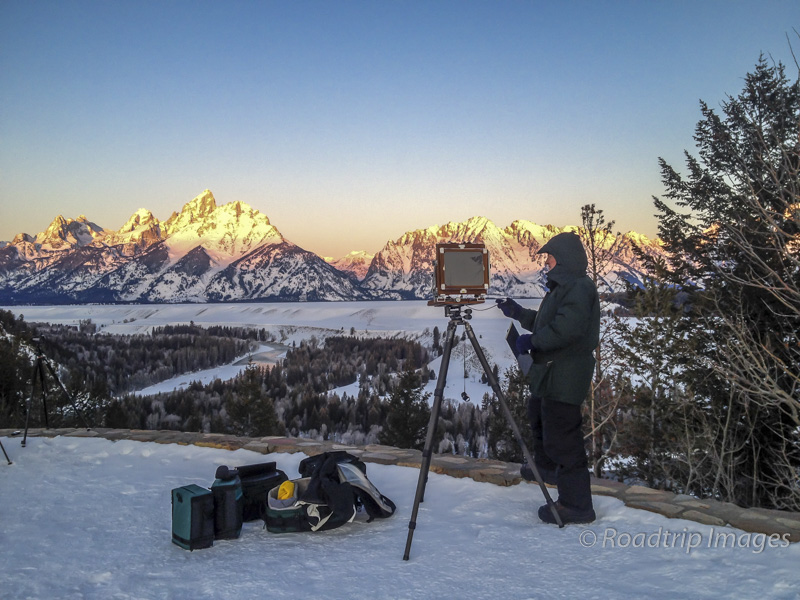
I love black and white. When I was shooting large format film, black and white was a key element of my workflow. For many scenes, I took black and white images along with color. I carried film holders loaded with both types of film. I have to say, doing high quality black and white film is hard. In many ways it’s harder than color. The processing is straight forward and basic printing in the darkroom is quite easy too. But that only gets you a basic, usually uninteresting B&W print. To get really top quality B&W results in the darkroom requires some real skill and experience. A print from a master B&W printer is a joy to behold. If you get the chance to see an exhibit of prints from the old masters you should. But I digress.
For some scenes, color can actually get in the way of telling the visual story. That was the case for this scene. If there isn’t a lot of color in the scene in the first place or if the contrast is pretty high, B&W may be a good alternative. With today’s heavy use of digital photography, B&W is usually not considered by most photographers. And that’s unfortunate. Lightroom and Photoshop make it pretty easy to convert your image to B&W. I’ve put both versions side by side below. The color version is not bad but I like the B&W one better. Especially when you see the full resolution images.

What I haven’t done yet is spend much time printing B&W from a digital image. There are large debates online as to whether a black and white inkjet print can look as well as a B&W negative printed directly onto wet chemistry paper in the darkroom. I’m not going to try and declare one over the other but I have had the opportunity to see a couple of B&W masters at work in the darkroom. John Sexton is considered one of today’s best B&W practitioners and was one of Ansel Adams’ assistants. Seeing what he can pull out of a negative and put into a print is just incredible. The late Ray McSaveney is another example that I had the opportunity to learn from. His approach was a little different from Sexton’s but his results spoke for themselves. If you get the chance to see their work up close you should.
So what do you think? Does the color version above work for you or does the B&W version capture the mood better. Please leave a comment below.